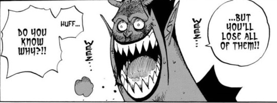
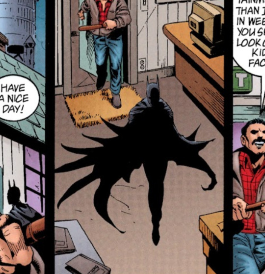
#some great bat shapes in these panels
Explore tagged Tumblr posts
Visit Tumblr Blog
Explore Tumblr blogs with no restrictions, modern design and the best experience.
Last Seen Tumblr Blogs


Fun Fact
Tumblr was the first site to host the blog for President Barack Obama in 2011.
Text

batman #19 (1943): batman makes a deadline
#some great bat shapes in these panels#i noticed right away that there was a new artist. some of the art in the last few issues was especially looking rough#this art is by dick sprang who was known to be bob kane's favourite ghost artist#batman 19#robin#batman#golden age batman
9 notes
·
View notes
Text
I cannot focus because I just want to work on a puzzle so I am outsourcing this decision lol *when I made the stingray pattern I realized as I was cutting out the fabric the tail was too short and too narrow so I just cut the tail by eyeballing it but I really should fix the paper pattern before I share it **I made a great orange and black halloween-y dress to fit 18" dolls, intending to make a black cat to wear it and give it to my friend. But I messed up a little making the black cat and changed the shape of its face and then put it in a poofy white pirate shirt and space bell bottoms and somehow, despite looking nothing like Howl Moving Castle, it feels exactly like Howl Moving Castle and I cannot bring myself to put it back in the dress ***an experiment in using scrap fabric and scrap batting for plushie filling! He is Very Dense and very cuddly but currently faceless because I originally intended to make him a mothman but I am considering making him a Creature so I can use another pair of embroidered eyes. Probably the green ones.
#the person behind the yarn#I had a pretty severe health flare up last week#I am okay now! but some of my health issues being endocrine related#means that sometimes flareups kinda disrupt my equilibrium a bit#and my brain is like. spinning out a bit focus-wise#it'll even out eventually but until it does it is hard to decide what to make lol#(the yellow and purple fabric is currently lying on the floor in the middle of my room)#(like a rug. it lives there now)
43 notes
·
View notes
Text
After 2 months of on-and-off work, I have sewn my very first pair of pants!
They are canvas work pants -- specifically the Jutland Pants pattern from Thread Theory.
I knew I'd need to do a bunch of fitting to get the size right, and decided to make a wearable muslin out of cheap canvas. I mostly succeeded at not being a perfectionist about these, but still ended up going a little nuts with the finishing details because I can't help myself.


I printed the PDF pattern at home, taped it all together, and then transferred it to gridded freezer paper to give me a final pattern that was more durable and easier to handle.

I started with their standard size 32, and did a full seat adjustment right off the bat because I could already tell the rear crotch seam was too short for my butt. My actual measurement there was pretty much identical to the size 36 pattern, so I printed that off and used it as a rough guide for making the adjustment before I transferred everything to the freezer paper.


I was really impressed with the instructions from Thread Theory, which are easy to follow and come with an additional sew-along blog that explains everything in a slightly different way. I've never made pants before (or really a garment anywhere near this complex), and it all came together smoothly.
I had some really cute scrap quilting fabric picked out for the pocket flap details, and decided to use it as an inspiration for the decorative stitching on the back right pocket. After some noodling around with different shapes from the print, I came up with a stylized crane I really liked.


Once I'd gotten the initial shape built (everything except the cargo pockets, waistband, and bottom hem), it was time for the first fitting!


Not a bad start. The seat adjustment turned out pretty much perfectly! There just wasn't enough ease in the thighs for freedom of movement (the fabric has zero stretch, and any work pants of mine need to allow for squatting, kneeling, and climbing). Also some tension across the hips was creating a weird... crotch situation.
I spent what felt like an eternity unpicking the outside and inside seams, and then pinning and re-pinning and basting extra fabric into the gaps until I got a shape that worked.
I ended up drafting a couple of long, narrow panels to insert into the side seams. They start about an inch below the waistband and end around the knee, which means I had to get them installed and finished before adding the cargo pockets on top.


This is where I decided to do felled, bound seams. The original pattern calls for flat felled seams, which I love the look of and enjoyed learning how to make. Unfortunately, canvas is bulky and doesn't like to take a crisp fold, and also frays like crazy. It just wasn't working.
I switched to binding each seam with bias tape, and then stitching it down flat so it had the same tidy, smooth, finish as a flat felled seam. I love how this turned out and will definitely be doing it again for future projects with fabrics that tend to fray.


The blue bias tape in the photo is one I had lying around the house and decided to use up for this project. Unfortunately, the panel inserts nearly doubled the number of long seams and I didn't have enough bias tape for them. So I learned how to make my own bias tape out of the gray pocket fabric and the yellow accent fabric. It's not terrible with the help of a bias tape maker, and I love having the ability to make binding that perfectly matches my project.
To adjust the inside seams, I sewed in a long gusset that runs from knee to knee. While the side panels were a pain in the ass and I've adjusted my pattern to eliminate them from future iterations, I think I want to keep the gusset. It's doing a great job of taking strain off the crotch seams when I move, and I'm also finding two smaller, bound, seams on the inner thigh much more comfortable than a single, chunky, serged one like I usually get with jeans.

Here's where I got to with the final fit (adding the waistband, pockets, and hem also changes the silhouette a little). I'm really happy with where I ended up. The pants are fitted enough through the waist and hips that they stay up comfortably without a belt, and make my butt look great. The looser fit through the thighs gives me a full, comfortable, range of motion, and the overall look is much closer to classic men's workwear than the slightly-shrink-wrapped stretch jeans that I've grown accustomed to.


Overall, I'm really happy with this pattern. Aside from adding the gusset, there's only a few changes I'll be making to the original design. I replaced the velcro fasteners for the cargo pockets with snaps (I honestly just hate velcro on clothing). I'll also want to add interfacing to the waistband lining in the future. The soft cotton I used is really comfortable, but adding a little stiffness should make it easier to work with while sewing the wastband and give me a cleaner finished look.
I learned so much about tailoring over the course of this project, and picked up a ton of new techniques. I feel like I not only have a great pattern that I know fits me well and that I can re-use whenever I want, but I also understand a lot more about how pants come together and how to get them to fit and move the way I want. It's super exciting!
4 notes
·
View notes
Text
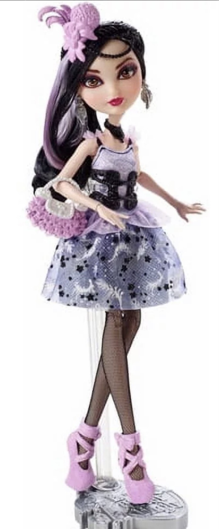
Vampire Heart Draculaura Review Part 3

Wait Draculaura, come back this way, we need to take a closer look and review your clothes! They’re all removable and separate pieces (a wonder for current day Mattel). And surprisingly fairly easy to undress and redress.


Her whole outfit looks lightly inspired by Elissabat’s movie persona: Veronica Von Vamp and Draculaura’s flashback version of herself in “Why do Ghoul’s Fall in Love?” More close ups of all the individual clothing pieces under the cut, as these reviews are long suckers.

She has small satin ribbons on both wrists and black lace (the same that is used for her neck and hems of both her dress and skirt). Out of curiosity I checked Haunte Couture Draculaura, and it is different.
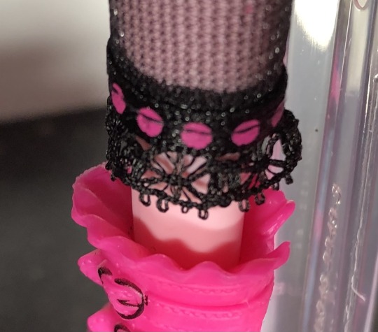
The rose on her chest is also made of metal (it doesn’t feel like plastic), another surprise from Mattel, and is a very light pink/lavender.
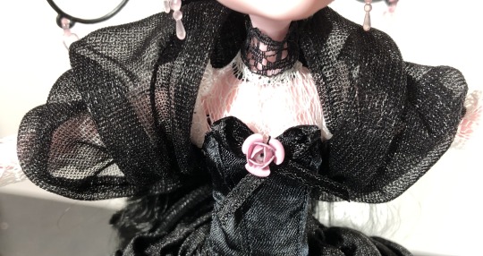
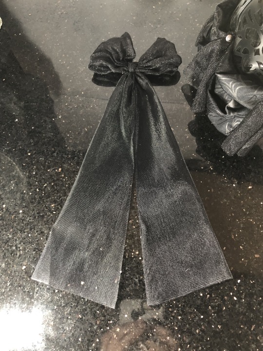
Now let’s get a closer look at large bow that also works as a shawl (I love that idea).
It’s so long and elegant, and like a longer version of Dawn of the Dance’s bow.

Here is the bow off of her. It was very easy to remove.
And here she is without her shawl/bow on:

Another really cute look for her. She just looks so cohesive and well designed!! Let’s now take some closer looks at her large skirt.

A close up of one of the panels to her skirt. The pearl beads are also the lightest of pale pink as well. I’m very glad to see their not glued on, but instead sewn. The panels really don’t feel like pleather, more of a rubbery plastic (hopefully they will not rot and peel). And there are two layers. It’s attached over this thicker plastic (vinyl?) that feels like one of those old blow up beach balls….or a pool toy. Hopefully it will not get sticky over time.
There you can see the two separate layers.
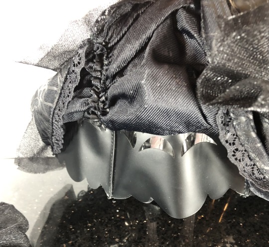
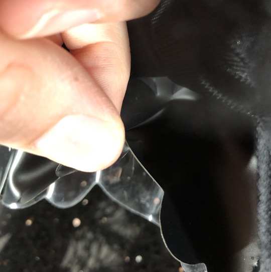
A better look at the scalloped edges and the ruffles layer over the edge (which is also a nicely hemmed, multi fabric piece).
And the patterned ruffle laying back down, more cute bat designs. You can see how the nylon(?) pieces seems already kinda rough at the ends; like it was cut with a dull pair of scissors.
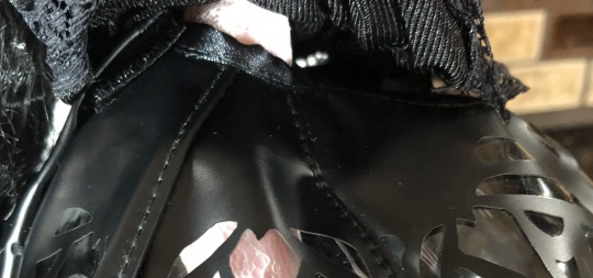
It is connected to the “mini dress” in two spots with a little bit of thread that is easily cut. And has velcro in the back.

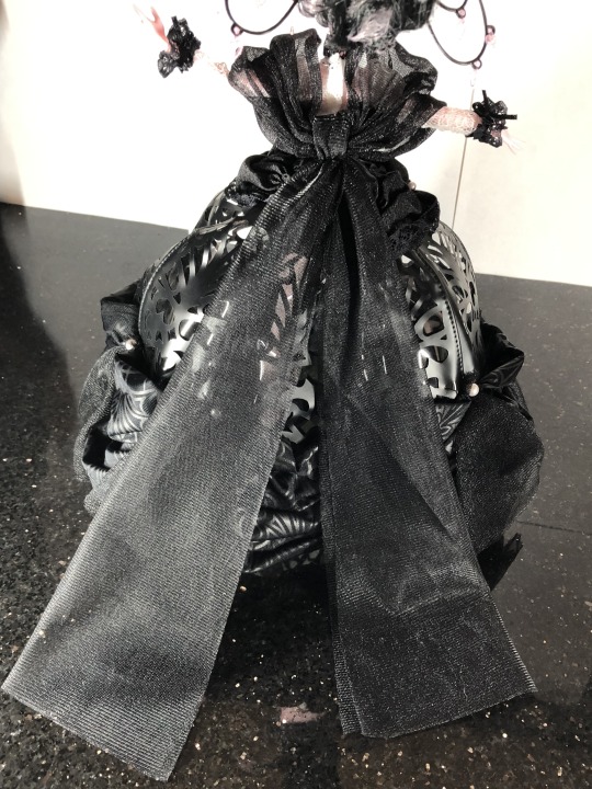
The bell skirt off the doll. The vinyl is nice in that it helps the dress keep its full shape. Even if an actual fabric bell skirt would have been great to see as well.
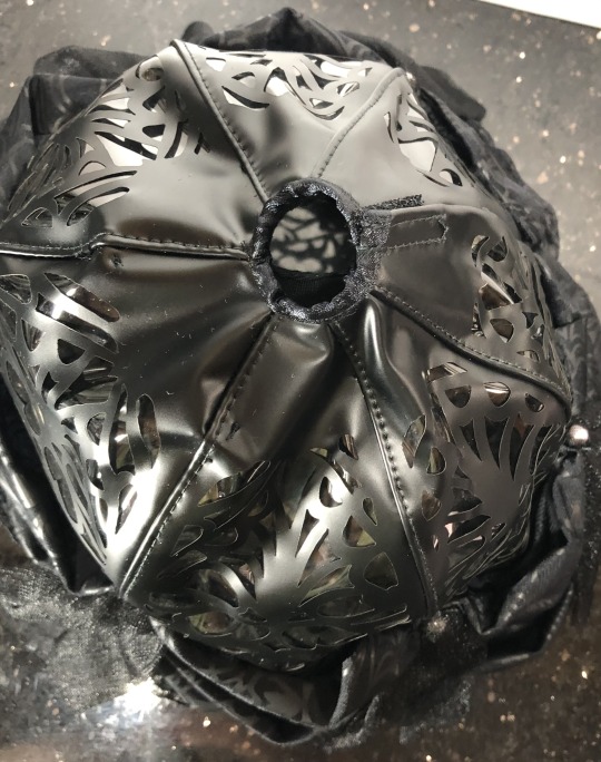

A picture from above and underneath the skirt. The pattern closest around the doll looks like a bunch of bats, and I love that detail.
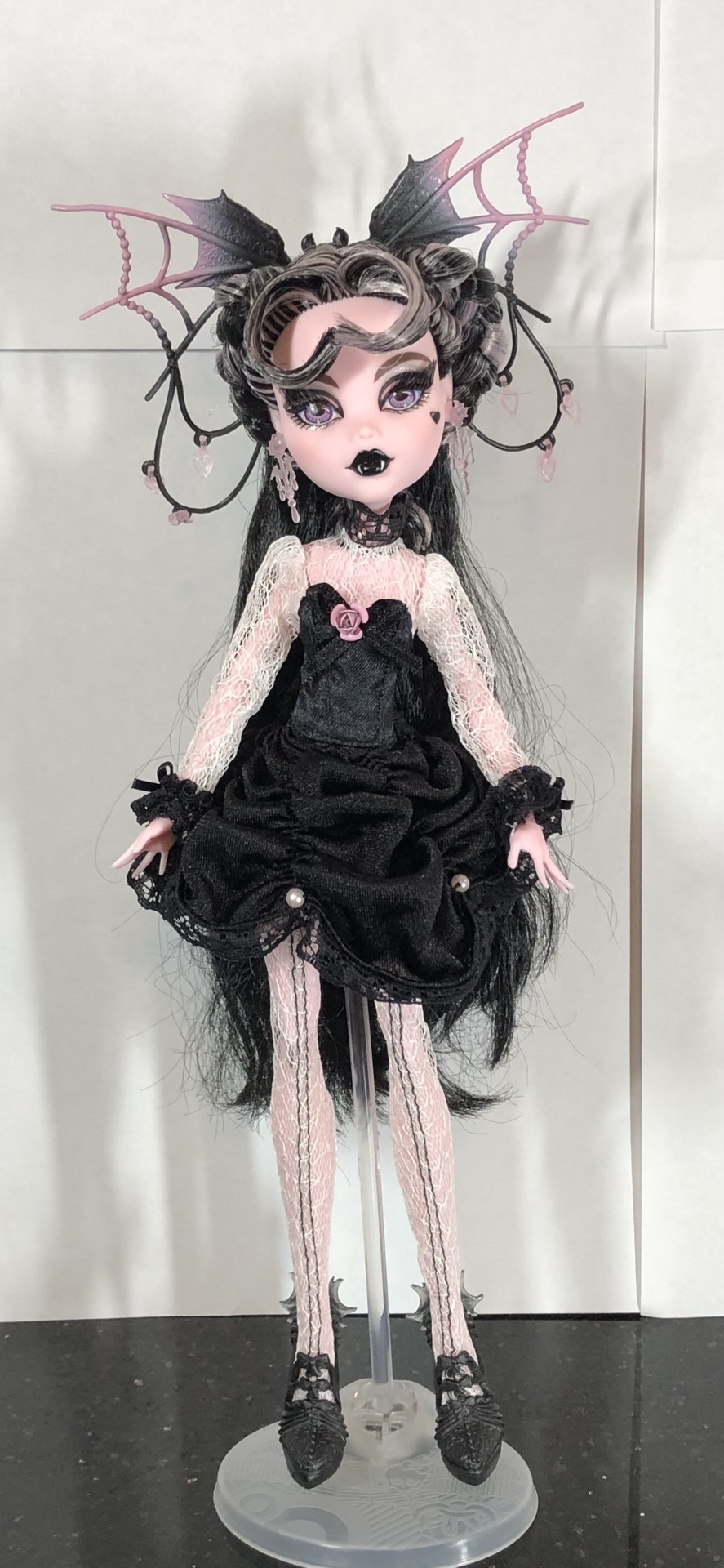
Without the bell-skirt, you get Monster High’s more traditional mini dress silhouette. But even just these two pieces look so nice together.
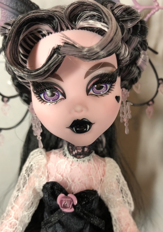
Another photo of her lovely face and a better look at her lightly puffed sleeves, and the black lace around her throat.
She’s also giving me some Duchess Swan vibes from Ever After High. Must be all the black and white.

Okay, now just the lace jumpsuit. I love the extra details of black thread along the front. Such a lovely addition! Also, I am surprised at how quickly I have gotten used to Draculaura on her shorter, chubbier body in G3 because she almost looks out of proportion here. But, I do miss the more delicate hand molds used in G1 over G3….anyways back to her outfit…
Just the mini dress and the bow together also don’t make a bad combination. I also didn’t want to keep removing her hands, so have a handless Draculaura in some of these photos.
I literally couldn’t stop taking photos of her……
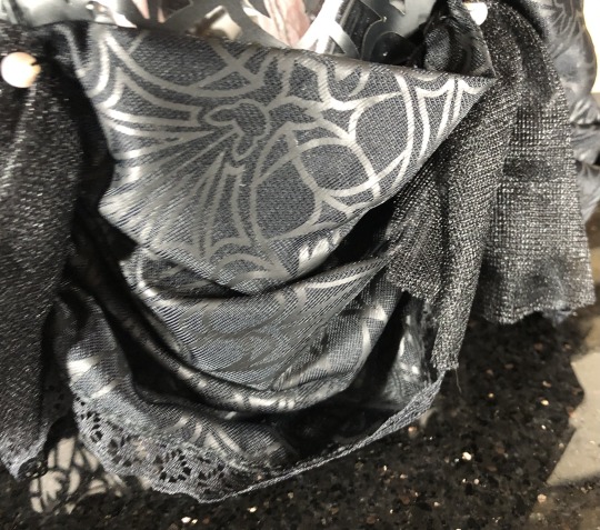
Okay, and here are all of her fabric clothing pieces lined up:

In my fourth and final part of this long review, I’ll be comparing her to some other dolls in my collection, including some of her other collector dolls, and the actual Queen of the Vampires.
#monster high#monster high doll#aleta’s toys#doll collecting#monster high dolls#dollbr#Monster high review#toy review#Doll review#monster high gen 1#monster high G1#Draculaura#vampire heart draculaura#doll collector#vampire heart
37 notes
·
View notes
Text
Memento Moria
Kiiiii-shi-shi-shi! Happy Halloween! Last time we took the whole month for Victoria Cindry with our #Spooky Sidestory. That was fun, if you don't know Cindry always borrowed from a famous ghost story about a spirit named Okiku. Which means you maybe need to think a little more in hindsight about her being an actress whose story relies on a theme of toxic obligation. We touched on Moria a bit, how he serves as a warning to what lies ahead. But I always wanted to give him his due. He's such a good seed for the yonko; baiting the idea of separating the crew, the zombies as an analogue for infighting, his shadow keeping you from even touching him. How many people did he beat without lifting a finger? This becomes a huge motif by Totland & Wano.
Moria is a great villain, though I'll never fault a younger fan for not quite getting it yet. Other characters share this idea of their dreams dashed by the buzzsaw of the New World, but Moria is the one who really embodies it. He's not just someone who experienced loss, he's defined by it. I mean this in the nicest way possible, you won't truly relate to Moria unless you've had some kind of tangible past success. Laurels to rest on long enough you know how dangerous that can be. I love this "whiteout" panel, how his face looks so bat-like. If you need a refresher on why this pertains to Kiku:
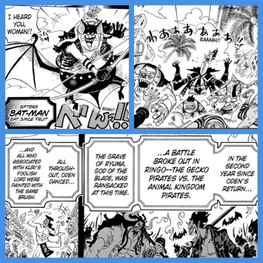
Kiku's introduction already leans on drawing from One Piece's history, subtly baiting key associations. Bat-Man being one of the first Gifters is certainly a choice, and his extremely shallotesque shape reinforces the reference. For those who don't know, Moria's animal motif isn't a gecko. It's a bat, Gecko Moria. Komori=bat. That in Kiku's intro is worth pointing out alone, much moreso when we get an update on Moria paired with a reflection (Catarina) of what we just highlighted out of the star of the first act. Those two are solid thematically, now add the Ringo ripple.
Does it have to mean anything? No, but theoretically if we wanted to have one of the Akazaya involved somehow there's a certain logic to Kiku the Ringo native being the intuitive choice. It's just like the Shanks/Buggy angle. We have someone so oddly worldly in Wano and yet again a known thread is set up it can easily run through her. I might actually want to see a flashback of Kiku & Moria having a chance encounter over Shanks. If only because I can guess how Shanks would go. You think Moria might make a play at recruiting the demonic prodigy of the Akazaya? Say what you will about his necromancy, which I'd imagine Kiku would abhor, I don't see Moria being the type to care about the trans aspect. Being earnestly good about it like Luffy seems reasonable.
Moria though, just as a villain he's grown on me. Or really I've grown, lost groups of people I once felt brought out the best in me. Lazily replaced them with shadows, spun my wheels in a position that sounded like a good enough spot to be in. I get Moria, he's kinda over it but hasn't fully given up. Just taking a lazier, safer approach because he's scared of what lies ahead. Shadows Asgard and taking in 1000 shadows is a big example of growing on me. Makes so much more sense when you see how Kaido/Wano builds off of the concept. Moria has the power to be a top contender, he doesn't have the will to control it. Shadow Asgard, false divinity.
Back then, even the Straw Hats see it right away. Luffy turns to the crew and tells them to take care of the rest cause he's gonna get reckless. I love the parallel of Luffy having to take on a taste of Moria's true power and Zoro well, that time when nothing happened. Kuma's getting plenty of focus now but we'll wait until the flashback ends to do him proper. Keeping that strong and famous crew he could count on over more zombie mooks won the day. That under the threat of daybreak is good shit.
14 notes
·
View notes
Text
FIENDSHIP IS MAGIC
(Part 58 of ?)
18+ readers only (sex scenes)
Return to the Master Story Index
Return to MLP Fan Fiction
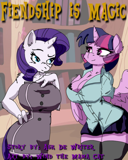
FIENDSHIP IS MAGIC
or
Making Fiends and Influencing Ponies
An Anthro *Tail* of the Mane Six
Part 58 of ? (Work in Progress)
by
De Writer
63566 words (story in progress)
© 2022 by Glen Ten-Eyck
All rights reserved. This document may not be copied or distributed on or to any medium or placed in any mass storage system except by the express written consent of the author.
//////////////
Copyright fair use rules for Tumblr users
This story is age restricted to 18+
years or older!
Users of Tumblr.com are specifically granted the following rights. They may reblog the story provided that all author and copyright information remains intact. They may use the characters or original characters in my settings for fan fiction, fan art works, cosplay, or fan musical compositions.
All sorts of fan art, cosplay, music or fiction is actively encouraged.
///////////////////////
New to the story? Read from the start HERE
///////////////////////
Rarity stepped up and joined Pinkie. “That sounds utterly delightful, my sweet Kin. Do include me as well. I have heard that Saddle Arabian dances do more than just tease.” She paused for effect before adding, “They are great exercise too!”
Both Kin and Pinkie giggled at her jest. Kin though did nod, “In fact, that is exactly right, if humorously put, Love. Shall we adorn ourselves in your lovely costumes?”
Pinkie slid into her wide satin dancing belt ornamented with rich gold looking fringe trims and row after row of light gold or silver colored coins. The others were getting into theirs as well, filling the room with a light chiming and tinkling from the many “coins.”
Kin and Pinkie were taken by surprise by a part of the costumes that had been concealed under the wide belts. Black lace topped fine fishnet hose! As Rarity was unrolling and pulling hers to fit snugly, with seams straight up the backs of her shapely legs, she informed the others, “I know that these aren't traditional at all, but I really was not thinking about the costumes being used for actual dancing! That's why we have garters for these hose and no panties at all!”
By the time that she had finished, Pinkie had hers on, the garters fastened neatly and was fitting her hooves into soft dancing slippers. Lastly, she had taken her dancing bra that was of matching satin and ornimented the same as her belt. That left a skirt made of colorfully dyed sheer gauze in two panels, both reaching from the belt to mid calf.
A quiet realization dawned as she examined the panels. “These tiny weights go to the bottom? How does it fasten? Oh, I see. These are meant to come off, aren't they?”
Kin nodded seriously, “Correct, Pinkie. While they are on, the weights will help the skirts to have the proper sway and swirl, while showing off lots of leg between the front and back panels. Later, we remove them one at a time for some seriously great looking veil work. You will see when I have given you the dance's reflexes and moves.”
Pinkie nodded, “I sort of know what you mean, my mare. I have seen a few demonstrations of Saddle Arabian dance. Rare made these outfits for more fun than just dancing!”
Her busy fingers twiddled with her bra's left shoulder strap. Most of the cup came away in her hand, leaving only a shelf under the now nearly bare pink boob. Her nipple stood out proud.
Without batting an eyelash, Kin gave a lewd look as she snickered, Saddle Arabian dance is not a strip tease! No reason at all that it can't become one though!”
Pinkie nodded thoughtfully as she re attached the bra cup, “We don't have a Saddle Arabian number in the big strip show. We ought to get Foamy and Clarice to look things over. It could be a fun thing to have in the show.”
Kin nodded briskly, “It really could but first you should learn to dance this way, so that we can show them. OK?”
Pinkie, snuggled up close simply nodded. Kin began what looked almost like a massage starting at the back of her head and working gently down her spine to the middle of her back.
Letting Pinkie go, she told her, “There, you are all done. You will still need to learn how to use those things that I have given you, but which you cannot feel yet. Wait for the music, then you will understand.”
Holding her arms out to Rarity, Kin invited, “Your turn now, my Sweet Love.”
Rarity snuggled close in her arms, enjoying the simple pleasure of contact with her. Kin repeated the same gentle, almost fondling dance of her hand from the back of her love's head, down to her mid back.
Releasing her, she told them, “Pinkie, put away that mirror! Now, finger cymbals (these are called zills, by the way) at the ready, pose like this for your starting position!”
As she was stretching into position, a look of comprehension drifted across her face. “Oh, so that's how it goes! Uh, Kin, I was inviting Foamy and Clarice to come and watch. They've never done choreography for Saddle Arabian dances and really want to see it!”
Kin nodded, “I'll let them in when they get here, Pinkie. Now, music!”
A pattering drum line began, with a flute joining in over the rhythm! All three mares began to sway in time, their zills clattering in unison with the music. The others were watching in awe. Kin's smoothly practiced hip lifts while holding her upper torso near perfectly still as she turned about were nearly entrancing. And this, they knew was barely the beginning!
Both Rarity and Pinkie, still keeping up the rhythm of their zills almost instinctively, began to get the hang of starting the back sway that the hip lift forced to happen from the bottom of their ribs instead of using the whole torso.
With looks of delight, both students got it at almost the same moment! Their movements became suddenly fluid in a way that they never had before! Pinkie began to work in moving her now vertical upper torso from side to side as she danced around in slow turn.
Rarity thoughtfully lowered her upper arms to nearly horizontal and, using only her shoulders, still maintaining that vertical rib cage, doing shoulder lifts, counter to her hip lifts!
Pinkie saw what she was doing as she turned to face Rarity and laughed with joy as she began working her shoulders too!
They both saw their mentor smiling with pleasure at the progress of her pupils. They then noticed that her tail was not a simple flag behind her, wagging to her hip movements! She was managing to keep it from side to side movement at all as it swished almost perfectly up and down! As soon as she was sure that her students were following her tail's movement, she added a side to side flair that resulted in her tail becoming a flowing circle, moving counter to the motion of her hips!
As fast as her eager students absorbed the movement, she smoothly converted it to a side to side swish. She began using the short time that she was on a hoof or the other during the hip lifts, to begin a spin that brought her skirts out in a flair about her! Kin spun about, not pausing any of her dance, shoulders, back, hips or tail! Her legs that had been flashing and showing briefly earlier were now on full active and sensual display!
The others after only a few tries got the moves down pat!
Kin slowed to a hip wriggling, belly rolling stop, facing them as she began to first, twitch slowly and then faster, make her tits shimmy side to side, while back to the basic hip lifting but accompanied by her tail swirling about first into a circle and then flowing smoothly into figure eight!
Just as the others got the whole set of moves flowing smoothly and, admittedly erotically, there came a tap at the door. Kin used her magic to open it without stopping the music or the whole dance!
It was not the expected Foamy and Clarice. It was a drop jawed AJ! She made a production of shutting the door before speaking, “Durn! Can't turn my back on you guys for a minute! What you doin' there sure look like fun! Wish that I knowed how to wiggle like that there!”
Kin had allowed the music to stop. “Come on in, AJ! Watch out what you wish for around here! That could easily happen! Neither of these lovely mares knew a single step of Saddle Arabian dance less than an hour ago!”
Adding a happy grin, she went on, “I see that you are wearing some of those fun “play clothes” that we made you!”
“Ah has. You give me this here sexy bod and them fun clothes. Added what Pinks there done mention about just walkin about making stallion balls blast, Ah had to try it!” She snickerd, cheeks blushing some behind her freckles. “She was right, sort of. Wasn't just stallions, neither. Three mares done propositioned me. I could'ave made three hundred bits!”
“That's neat, AJ, but why come here?”
“Ah wanted to thank you fer it all. Ah done discovered two things just lately. First, Ah likes Mares a whole lot, but second, Ah likes bein' the center of attention too. That there shy was 'cause cause Ah didn't think Ah was really purty.
“Was you serious about showin me how ta dance like that? Yeh, Ah really would like ta be able ta do that. Watched through the window a little 'fore Ah knocked. Ah sorta 'spected something like that from you, Kin, bein' who you are, but Rare an Pinks? That blowed me away!”
Rarity clattered her zills for attention and pointed to the work table. “You want to learn, AJ? Got you a costume right there. Let Kin do her thing to help you learn the reflexes and how some moves work. The dance will grow on you like you are remembering it. It's amazing, really.”
TO BE CONTINUED
<==PREVIOUS ~ NEXT==>
Return to the Master Story Index
Return to MLP Fan Fiction
#FIENDSHIP IS MAGIC#Part 58 of ?#age restricted 18+#MLP Fan Fiction#Written by De Writer#WORK IN PROGRESS
8 notes
·
View notes
Text
Sception reads Cass Cain #6
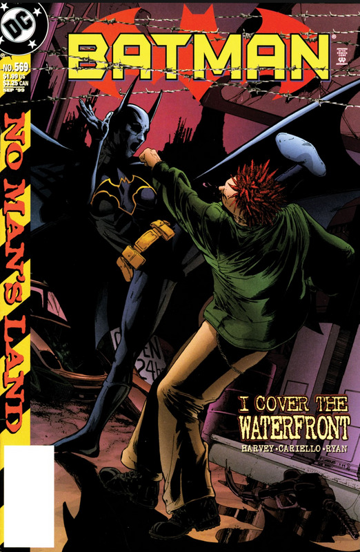
Batman #569, September 1999 written by Janet Harvey, pencils by Sergio Cariello
So here we have the first instance where Cassandra is the main character of an issue, and the primary focus of its story, but the lead creatives aren't her primary team of Peterson, Puckett and Scott. And for a mainstream comic hero that's a big test. Harvey takes a different approach to writing a non-verbal character than Puckett, one that's maybe less innovative and experimental, but that's so easy and obvious that I really have to wonder why I didn't see the same approach taken more often. But I'm getting ahead of myself.

The comic starts with a non-super-villain affiliated gang trying to kick this Sanchez guy out of his gas station in an area they've claimed, presumably to take whatever gas and supplies are left there. And in blue boxes we have some faux noir-esque narration of the type commonly employed throughout bat books from the dawn of time, both for exposition and for letting letting the audience in on the main characters' thoughts. I'm not a big fan of the gimmick generally, and one of the things I liked about Cass, especially in her early non-verbal days, was that her book focused more on storytelling and characterization through the art on the panel. I know "show don't tell" is a bit of an overused cliche, but imo it invited the reader to empathize more directly with Cass since you didn't have this layer of text in between you and her.
But not every writer and artist were up to that - and Cass's faceless costume design made it that much harder. Most back book writers had been relying on their narration blocks for so long that they didn't know how to tell a story, let alone a bat story, without them. As a result, it seemed like most of the bat book writers just didn't know how to use Cass, and so she showed up sparingly in other books, and when she was just this silent shadow that none of the other bat family characters could meaningfully relate to.
The funny thing is, looking back now at this issue for the first time, from before her solo book even started, Harvey had already figured out how to put the circle through the square hole.
Because the blue text blocks are Cass's thoughts, or at least describing what she's thinking, even if in universe she isn't thinking these things in words exactly. In the same way that a comic might write out a foreign character's dialog in English, and then just tack a note that in-universe they're speaking French or whatever.
Which, yeah, is just the obvious solution to the problem? If you're writing a Cass story but don't know how to do that without your typical narration boxes, then just use your typical narration boxes.
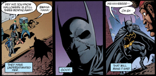
Oh, also I love that close up in the middle panel there, with her big smile - drawn right through the mask the way I keep saying artists should do. Because it's ok to cheat in comic art. Spider man cheats by having the eyes on his mask change shape to show his expression all the time. But anyway, yeah, with that big smile you can feel her easy confidence and excitement. She's enjoying herself. She's having fun. This is play to her. That idea, that she /enjoys/ being Batgirl, will be important when we get into some of her issues with guilt later in her own book, so it's great that we're already seeing that side of her here, an aspect of her personality that is entirely lost when she's portrayed as just Batman's silent ninja enforcer.
But yeah, that's Cass right there. That's our girl, that's who we're here to see.
We also see that her instincts are dangerous - she was taught by an assassin - trained to kill. No matter how much fun she's having, she can't just cut loose, can't get carried away and lose focus. She has to actively restrain herself. She starts to have fun flexing her fighting skills, but then she remembers what those skills were originally meant for, what she was originally meant for, and the fun is over.
Mr. Sanchez is in high spirits after the rescue and very chatty. Cass gets annoyed by this, which I choose to read as reflexive insecurity about not being able to communicate verbally herself.

Cass signals Bat HQ that she's secured the gas station. Apparently there had been a plan to send extra help to get some gas for the hospital (the hospital is still functional? Why isn't Dr. Thomkins there then?), but it's too dangerous at the moment so Cass is just going to have to hold the station by herself overnight. Which is framed as a tough mission, a test of her competence.


There's a flashback to a few hours earlier when the mission was first assigned, and we get to see how excited Cass is to be useful, how eager she is to please Bruce in particular. Especially nice since we get to see her emoting without the mask in the way. The scene is nice, and it emphasizes both her youth - she's still just a teenager - and her motivations. We also see Barbara both vouching for Cass's ability and worrying about her safety, which fits the big sister/surrogate mother role she'll serve in Cass's ongoing.
Meanwhile, Bruce still isn't completely sure what to make of Cassandra. He trusts Barbara's recommendation, and has seen first hand Cass's martial skills and her commitment to finding nonlethal solutions to problems even where none seems possible, but yeah, this is very much a test.

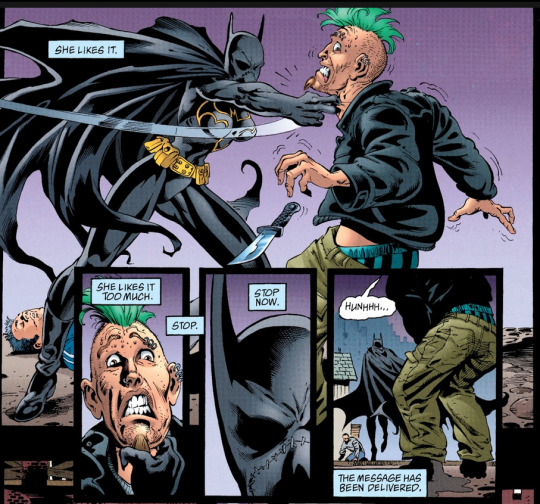
Cass gets frustrated with the chatty Mr. Sanchez and heads outside, where we get a bunch more of the narration blocks and some art I don't especially care for, with weird comic woman proportions and spray-painted-on costume and weird boots. The ruined city background art is pretty nice, and none of this is terrible looking. Just not particularly great. I like the way the artist draws Cass's Batgirl outfit when she's just a lurking shadow, just a silhouette, like in that first panel there, even if it's small, or this panel from earlier that I didn't grab before:
Yeah, good spooky Cass silhouettes. But when the details fill in, not as much.

Anyway, the thugs come back later with a rocket launcher, there's some fighting, but while Cass is able to save Mr. Sanchez, the gas station is destroyed.
Which means Cass failed her mission. Failed the test.
Failed Batman.

Cariello does a fantastic job portraying how fucking pissed Cass is in this panel, and how terrifying she is in her anger. Again, when he's rendering her as a spooky silhouette it's great.
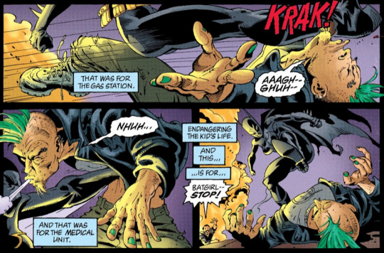
Again Cassandra risks gets carried away - this time by her anger rather than having fun - and her restraint slips, letting the lethal training her father drilled into her come to the surface.

Sanchez talks Cass down, and she turns away just as Bruce shows up, and thankfully there was a separate stash of gas they can take to keep the hospital generators running.
....
Overall this was a pretty good issue for our girl. While I might not like some of the art or some of the writing choices as much as if this issue had been done by Peterson, Puckett, and Scott, this is still very much a Cass Cain Batgirl story, the kind you might have seen in her solo book. The tone is right, the themes are there, the interpersonal dynamics between her, Bruce, and Barbara. Her character and personality comes across well.
Given how badly her solo book drops off later on, her disastrous villain period, the mess that followed after, how I never really felt like she found her footing again... over the years I've kind of built up this idea in my head that, as great as Cass was in her prime, maybe she just wasn't a good fit for the collaborative, factory format of mainstream US superhero books. Like only one team could ever get her right, which made her a bad fit in a medium where creative teams are constantly shifting and a shared universe where characters are regularly crossing over into each others stories.
But this book stands as an easy and very early refutation of that entire thought. Harvey isn't writing this book like Puckett would have, and Cariello isn't illustrating like Scott would have. This is a book that looks and reads much more like typical Bat book fare, and yet Cass is working fine here. That's very recognizably our girl. And this right after the previous issue I looked at, where she worked pretty well as a side character.
If multiple creative teams outside of her own could get her right this early on, why did others fail - and fail so very badly - later on, when the character if anything should have been more well established?
10 notes
·
View notes
Text
CHAPTER VII—HACKNEY-COACH STANDS
We maintain that hackney-coaches, properly so called, belong solely to the metropolis. We may be told, that there are hackney-coach stands in Edinburgh; and not to go quite so far for a contradiction to our position, we may be reminded that Liverpool, Manchester, ‘and other large towns’ (as the Parliamentary phrase goes), have their hackney-coach stands. We readily concede to these places the possession of certain vehicles, which may look almost as dirty, and even go almost as slowly, as London hackney-coaches; but that they have the slightest claim to compete with the metropolis, either in point of stands, drivers, or cattle, we indignantly deny.
Take a regular, ponderous, rickety, London hackney-coach of the old school, and let any man have the boldness to assert, if he can, that he ever beheld any object on the face of the earth which at all resembles it, unless, indeed, it were another hackney-coach of the same date. We have recently observed on certain stands, and we say it with deep regret, rather dapper green chariots, and coaches of polished yellow, with four wheels of the same colour as the coach, whereas it is perfectly notorious to every one who has studied the subject, that every wheel ought to be of a different colour, and a different size. These are innovations, and, like other miscalled improvements, awful signs of the restlessness of the public mind, and the little respect paid to our time-honoured institutions. Why should hackney-coaches be clean? Our ancestors found them dirty, and left them so. Why should we, with a feverish wish to ‘keep moving,’ desire to roll along at the rate of six miles an hour, while they were content to rumble over the stones at four? These are solemn considerations. Hackney-coaches are part and parcel of the law of the land; they were settled by the Legislature; plated and numbered by the wisdom of Parliament.
Then why have they been swamped by cabs and omnibuses? Or why should people be allowed to ride quickly for eightpence a mile, after Parliament had come to the solemn decision that they should pay a shilling a mile for riding slowly? We pause for a reply;—and, having no chance of getting one, begin a fresh paragraph.
Our acquaintance with hackney-coach stands is of long standing. We are a walking book of fares, feeling ourselves, half bound, as it were, to be always in the right on contested points. We know all the regular watermen within three miles of Covent-garden by sight, and should be almost tempted to believe that all the hackney-coach horses in that district knew us by sight too, if one-half of them were not blind. We take great interest in hackney-coaches, but we seldom drive, having a knack of turning ourselves over when we attempt to do so. We are as great friends to horses, hackney-coach and otherwise, as the renowned Mr. Martin, of costermonger notoriety, and yet we never ride. We keep no horse, but a clothes-horse; enjoy no saddle so much as a saddle of mutton; and, following our own inclinations, have never followed the hounds. Leaving these fleeter means of getting over the ground, or of depositing oneself upon it, to those who like them, by hackney-coach stands we take our stand.
There is a hackney-coach stand under the very window at which we are writing; there is only one coach on it now, but it is a fair specimen of the class of vehicles to which we have alluded—a great, lumbering, square concern of a dingy yellow colour (like a bilious brunette), with very small glasses, but very large frames; the panels are ornamented with a faded coat of arms, in shape something like a dissected bat, the axletree is red, and the majority of the wheels are green. The box is partially covered by an old great-coat, with a multiplicity of capes, and some extraordinary-looking clothes; and the straw, with which the canvas cushion is stuffed, is sticking up in several places, as if in rivalry of the hay, which is peeping through the chinks in the boot. The horses, with drooping heads, and each with a mane and tail as scanty and straggling as those of a worn-out rocking-horse, are standing patiently on some damp straw, occasionally wincing, and rattling the harness; and now and then, one of them lifts his mouth to the ear of his companion, as if he were saying, in a whisper, that he should like to assassinate the coachman. The coachman himself is in the watering-house; and the waterman, with his hands forced into his pockets as far as they can possibly go, is dancing the ‘double shuffle,’ in front of the pump, to keep his feet warm.
The servant-girl, with the pink ribbons, at No. 5, opposite, suddenly opens the street-door, and four small children forthwith rush out, and scream ‘Coach!’ with all their might and main. The waterman darts from the pump, seizes the horses by their respective bridles, and drags them, and the coach too, round to the house, shouting all the time for the coachman at the very top, or rather very bottom of his voice, for it is a deep bass growl. A response is heard from the tap-room; the coachman, in his wooden-soled shoes, makes the street echo again as he runs across it; and then there is such a struggling, and backing, and grating of the kennel, to get the coach-door opposite the house-door, that the children are in perfect ecstasies of delight. What a commotion! The old lady, who has been stopping there for the last month, is going back to the country. Out comes box after box, and one side of the vehicle is filled with luggage in no time; the children get into everybody’s way, and the youngest, who has upset himself in his attempts to carry an umbrella, is borne off wounded and kicking. The youngsters disappear, and a short pause ensues, during which the old lady is, no doubt, kissing them all round in the back parlour. She appears at last, followed by her married daughter, all the children, and both the servants, who, with the joint assistance of the coachman and waterman, manage to get her safely into the coach. A cloak is handed in, and a little basket, which we could almost swear contains a small black bottle, and a paper of sandwiches. Up go the steps, bang goes the door, ‘Golden-cross, Charing-cross, Tom,’ says the waterman; ‘Good-bye, grandma,’ cry the children, off jingles the coach at the rate of three miles an hour, and the mamma and children retire into the house, with the exception of one little villain, who runs up the street at the top of his speed, pursued by the servant; not ill-pleased to have such an opportunity of displaying her attractions. She brings him back, and, after casting two or three gracious glances across the way, which are either intended for us or the potboy (we are not quite certain which), shuts the door, and the hackney-coach stand is again at a standstill.
We have been frequently amused with the intense delight with which ‘a servant of all work,’ who is sent for a coach, deposits herself inside; and the unspeakable gratification which boys, who have been despatched on a similar errand, appear to derive from mounting the box. But we never recollect to have been more amused with a hackney-coach party, than one we saw early the other morning in Tottenham-court-road. It was a wedding-party, and emerged from one of the inferior streets near Fitzroy-square. There were the bride, with a thin white dress, and a great red face; and the bridesmaid, a little, dumpy, good-humoured young woman, dressed, of course, in the same appropriate costume; and the bridegroom and his chosen friend, in blue coats, yellow waist-coats, white trousers, and Berlin gloves to match. They stopped at the corner of the street, and called a coach with an air of indescribable dignity. The moment they were in, the bridesmaid threw a red shawl, which she had, no doubt, brought on purpose, negligently over the number on the door, evidently to delude pedestrians into the belief that the hackney-coach was a private carriage; and away they went, perfectly satisfied that the imposition was successful, and quite unconscious that there was a great staring number stuck up behind, on a plate as large as a schoolboy’s slate. A shilling a mile!—the ride was worth five, at least, to them.
What an interesting book a hackney-coach might produce, if it could carry as much in its head as it does in its body! The autobiography of a broken-down hackney-coach, would surely be as amusing as the autobiography of a broken-down hackneyed dramatist; and it might tell as much of its travels with the pole, as others have of their expeditions to it. How many stories might be related of the different people it had conveyed on matters of business or profit—pleasure or pain! And how many melancholy tales of the same people at different periods! The country-girl—the showy, over-dressed woman—the drunken prostitute! The raw apprentice—the dissipated spendthrift—the thief!
Talk of cabs! Cabs are all very well in cases of expedition, when it’s a matter of neck or nothing, life or death, your temporary home or your long one. But, besides a cab’s lacking that gravity of deportment which so peculiarly distinguishes a hackney-coach, let it never be forgotten that a cab is a thing of yesterday, and that he never was anything better. A hackney-cab has always been a hackney-cab, from his first entry into life; whereas a hackney-coach is a remnant of past gentility, a victim to fashion, a hanger-on of an old English family, wearing their arms, and, in days of yore, escorted by men wearing their livery, stripped of his finery, and thrown upon the world, like a once-smart footman when he is no longer sufficiently juvenile for his office, progressing lower and lower in the scale of four-wheeled degradation, until at last it comes to—a stand!
_____
Title | Previous Chapter | Next Chapter |
0 notes
Text
Best Cat Toys for Indoor Cats: Keeping Them Engaged and Active
Indoor cats require a stimulating environment to stay healthy, happy, and active. Without the natural stimulation they’d get from being outside, indoor cats can become bored, stressed, or even overweight. To counteract this, it’s essential to keep them engaged with toys that spark their hunting instincts, encourage movement, and provide mental stimulation. In this article, we’ll explore the best cat toys for indoor cats and how they can help maintain your pet’s well-being. We'll also touch on how dog toys and services like pet day care can play a role in their enrichment.

Why Cat Toys Are Essential for Indoor Cats
Cats are natural hunters, and even indoor cats retain their wild instincts. Without the right outlets for this energy, your cat may resort to destructive behaviors like scratching furniture or overeating out of boredom. Cat toys provide both physical and mental stimulation, keeping your feline friend entertained and in good health.
Benefits of Cat Toys
Physical Exercise: Regular activity helps indoor cats stay fit and prevents obesity, which can lead to a range of health problems.
Mental Stimulation: Toys challenge a cat’s brain, keeping them sharp and reducing stress and anxiety.
Bonding: Playing with your cat helps strengthen your bond, making your relationship more fulfilling for both of you.
Natural Instincts: Toys mimic the hunting experience, satisfying your cat's innate need to stalk, chase, and pounce.
Types of Cat Toys to Keep Indoor Cats Engaged
Not all cat toys are created equal. Some are better suited for certain activities, while others are designed to mimic the behaviors cats naturally enjoy. Below are some of the best categories of toys to keep your indoor cat active and entertained.
1. Interactive Toys
Interactive toys are a fantastic way to engage your cat in active play, mimicking the movement of prey. These toys often require your participation, which can make playtime even more engaging for your cat.
Laser Pointers
Laser pointers are a classic example of interactive toys. They encourage cats to chase the elusive red dot, providing great physical exercise. However, always make sure to end the game by letting your cat “catch” something physical, like a small dog toy or feather, to prevent frustration.
Feather Wands
Feather wands are another excellent option for interactive play. These toys simulate the movement of birds, appealing to your cat’s predatory instincts. Move the wand in unpredictable ways to mimic real prey and keep your cat guessing.
2. Puzzle Toys
Cats are intelligent animals that thrive on mental stimulation. Puzzle toys challenge your cat to solve problems to earn a reward, such as treats or kibble. These toys are perfect for cats who tend to eat too quickly or those that could benefit from some mental exercise.
Food-Dispensing Toys
Food-dispensing toys like treat balls or puzzle feeders encourage cats to work for their food. As your cat bats the toy around, kibble or treats are slowly released, providing a rewarding experience that stimulates their mind and satisfies their hunger.
Puzzle Boards
Puzzle boards feature hidden compartments or sliding panels that require your cat to use their paws or nose to access treats. These toys are a great way to engage your cat’s problem-solving skills while keeping them entertained for hours.
3. Catnip Toys
Catnip is a herb that many cats find irresistible. It triggers a euphoric reaction in most cats, making it a fun and natural stimulant. Catnip toys are perfect for encouraging even the laziest cats to get up and move.
Stuffed Catnip Toys
Stuffed toys filled with catnip are a simple yet effective way to stimulate your cat. These toys come in various shapes and sizes, from small mice to larger plush animals. Watch as your cat wrestles, kicks, and pounces on these scented toys.
Refillable Catnip Toys
For long-term use, consider refillable catnip toys. These allow you to refresh the catnip as the scent fades over time, ensuring that your cat remains interested. Refillable toys often feature pouches or Velcro openings for easy refilling.
4. Ball Toys
Balls are timeless toys that encourage physical activity in cats. The unpredictability of a rolling ball simulates the movement of small prey animals, triggering a cat's hunting instincts.
Lightweight Balls
Lightweight balls, often made of plastic or foam, are easy for cats to bat around. Some varieties come with bells or rattles inside, adding an auditory element that makes playtime even more exciting.
Electronic Balls
For added excitement, electronic balls can provide hours of entertainment. These battery-powered toys move on their own, simulating the erratic movements of a mouse or bug. Some electronic balls even light up, making them perfect for night-time play.
5. Scratching Toys
Scratching is a natural behavior for cats, and without the right outlets, they might turn to your furniture. Scratching toys allow your cat to indulge in this instinct while keeping your home safe from damage.
Scratching Posts
A classic cat toy, the scratching post, gives your cat a dedicated place to sharpen its claws. Look for scratching posts made from durable materials like sisal, which withstands heavy use and provides a satisfying texture for cats.
Cardboard Scratching Pads
Cardboard scratching pads are another popular option, especially for cats who prefer horizontal scratching surfaces. Many cardboard scratchers come infused with catnip for added appeal, making them irresistible to your feline friend.
Can Dog Toys Work for Cats?
It’s not uncommon for pet owners to have both cats and dogs, which may lead you to wonder if your feline can also enjoy dog toys. While some dog toys can be suitable for cats, it’s important to consider the size, texture, and function of the toy.
Toy Size and Durability
Dog toys are often larger and more durable than cat toys, which may make them less appealing or harder to use for cats. However, smaller dog toys, like soft stuffed animals or small balls, can work well for cats that enjoy wrestling or chasing.
Caution with Chew Toys
Chew toys designed for dogs are usually too tough for cats and could pose a risk if your cat tries to chew on them. Stick to cat-safe options to prevent any injuries or dental issues.
How Pet Day Care Enhances Toy Playtime
If your indoor cat spends long periods alone during the day, consider the benefits of pet day care. Many facilities offer enrichment activities, including playtime with a variety of toys. This can help break up the monotony of your cat’s day and ensure they get the exercise and interaction they need.
Social Interaction and Stimulation
Pet day care provides an environment where your cat can interact with trained professionals and possibly other pets. This type of interaction, combined with the use of engaging toys, can help your cat burn off energy and reduce boredom, leading to better overall behavior at home.
Variety of Toys and Activities
At a pet day care facility, your cat will have access to a wider variety of toys and activities than they might at home. From climbing structures to interactive toys, these facilities are designed to keep your pet active and stimulated throughout the day.
Conclusion
Investing in the right cat toys is crucial for keeping your indoor cat healthy, active, and entertained. From interactive toys that mimic prey to puzzle toys that challenge their minds, the options are endless. While some dog toys may work in a pinch, it’s important to choose toys specifically designed for your cat’s needs. Additionally, services like pet day care can offer even more opportunities for play and enrichment, ensuring that your cat leads a happy and fulfilled life indoors.
By incorporating a variety of toys into your cat’s daily routine, you’ll help prevent boredom, promote healthy activity, and strengthen your bond with your feline companion.
0 notes
Text
Vest 2
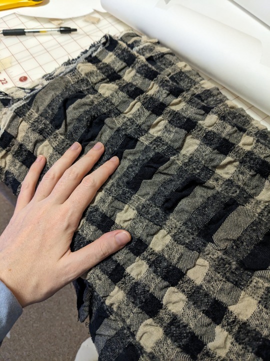
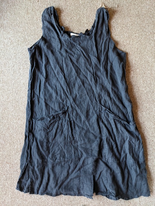
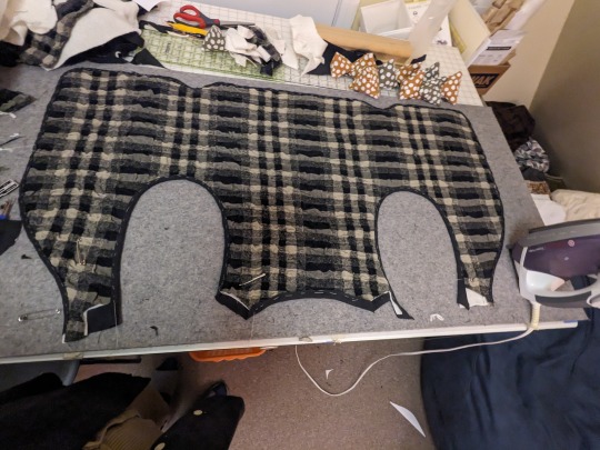
the yardage & dress. the yardage was a beautiful cotton/wool from miss matatabi that i accidentally tortured in the washing machine. it looked even worse before i stretched it back out as much as i could. now it is a very interesting cotton/felted wool crinkle plaid. i liked the pockets on the dress and figured i could incorporate them.
I realised the dress was a trapeze cut so I took apart the panels, squared them off, and sewed most of them back together to make an on-grain (mostly... its linen and I'm not great at this) rectangle of fabric
i quilted the linen to some batting (just a few vertical lines - i didn't want to sew through the pockets or have a quilted 'look' to the linen side. we'll see how that pans out; i'm not planning on washing this beyond some spot cleaning so it shouuuuld be fine. i then laid the yardage on top and safety pinned the three layers together.
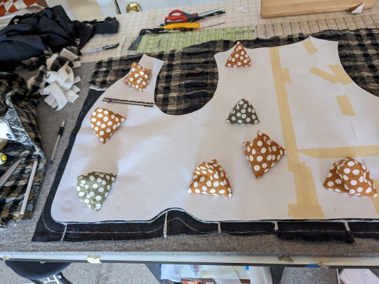
doubled up and patched together the pattern* so i could lay out the whole thing with as few seams as possible (just shoulder seams!) for this vest, I didn't have enough black linen for bias binding and none of my remnants looked good against both the yardage and linen to me. so i decided to try cutting the linen side with enough of an allowance to double fold over and sorta self bind the edges. this is stupid and doesnt work very well, but perfection is not my aim and the yardage is fucked up beyond belief anyway so what are a few more weird wrinkly bits? * This purl soho pattern, which i've modified heavily in length and shape, especially the front
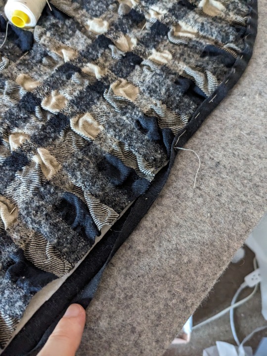
basted the edges like so. i rolled with any folds/pleats needed to make the edge of the yardage fit into the linen layer neatly. i left the back neckline and recut it a couple of times to try to fix a fit issue (it helped a little but i think i need a redraft or darts to fix it properly)
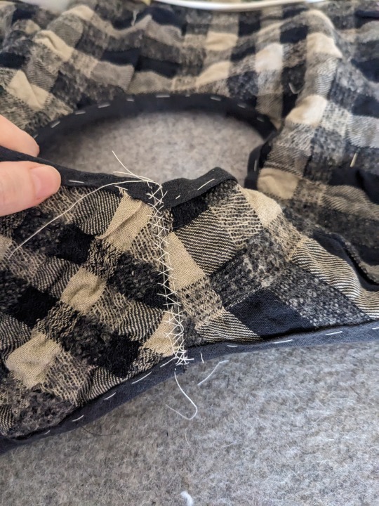
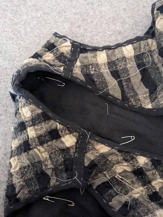
i knew my sewing machine would not be able to evenly feed the crinkled yardage even with a walking foot, so i tried something new and cut off the shoulder seam allowance entirely and instead joined it with a strip of linen i wrapped around the entire seam that i would fell down on either side. i also left the hand basting in underneath to give it a little extra strength.
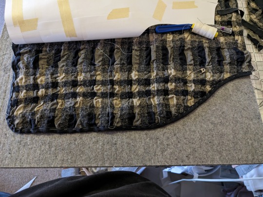
all basted. all i had to do from this point was make the ties and fell everything down! didn't take photos of the tie process but i just sewed a tube, used a loop turner to turn them inside out, folded one end in and hand stitched it together to close them off and hide the raw edges.
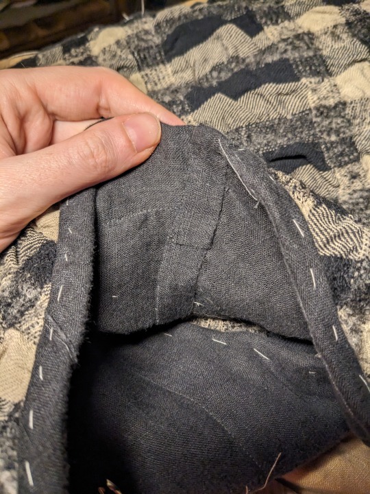
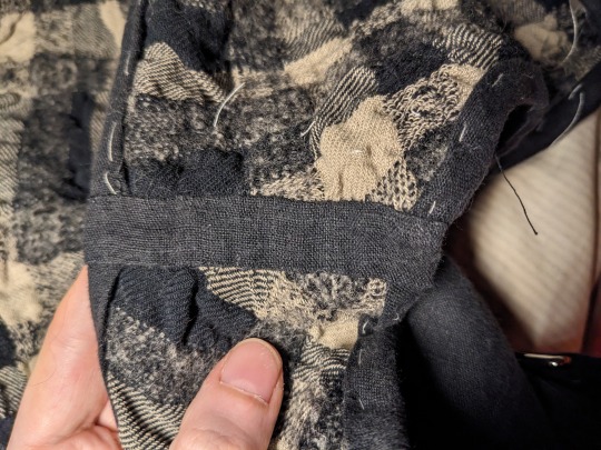
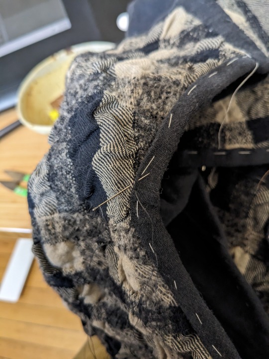
shoulder seam felled down.i'm not an amazing hand sewer but i'm getting better, especially thanks to resources like this one. when i got to felling down the parts where i wanted the ties, i tucked the ties in between the folded over linen layer and yardage, tacked them to the yardage & batting inside the seam allowance, and then continued felling down the linen over the ties.
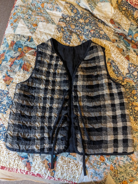
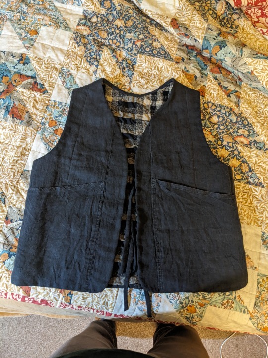
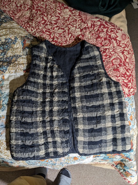
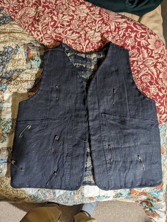
finished vest! not pattern matched, you can see where i was more successful stretching the shrunken fabric back out, odd tension where the 'binding' fights the grain of the fabric... but i'm happy with it, especially the pockets. i'm glad to get some use out of my stupid mistake with the wool/cotton plaid yardage. i might pick stitch/ hand quilt some areas eventually but for now i'm gonna leave it.
1 note
·
View note
Text
{The Horizon}
(manhwa) 21 chapters 2016
Author and Artist : Jeong ji-hoon
I stumbled across this manhwa a week ago.The hell that is TikTok kept recommending me slideshows of some of the chapters and right from the beginning I knew it was something extremely sad and intense.I tend to stray away from these sort of media,especially nihilistic and pessimistic ones that are depressing just for the romantization of it or for the sake of just..being depressing.But TikTok really wanted me to read this manhwa as it recommended it to me over five times back to back.So I gave in.And I am so greatful that I did
Right off the bat I have to warn you this work deals with extremely heavy ,mature themes.War,loss,death and survival are prominent things in this manhwa and it does not hold back.As well as a big trigger warning for attempted SA ((even though in my opinion the themes surrounding it and the way it was handled is very calculated and careful))
In an Un-named post apocalyptic world,where war and disease have overtaken most of humanity ,a boy and a girl find themselves all alone,having lost their families and homes,with no choice but to keep moving forward in a long unknown road.They encounter many different people as they go,shaping their story and their experience of the horrors of war,through the eyes of two kids who have no one but each other.What absolutely blew me away is the story of these two and countless others presented in just 21 chapters.The commentary on war,child soldiers,the philosophising of the meaning life and death take in such a setting and most importantly,hope, perseverance and love.A diverse cast of characters,even though the story is much more focused on the illustrative part rather than the dialogue.I do not want to spoil much(as always) as I did end up crying continously while reading it after it had reached the middle.
For a story based on it's illustrations I wouldn't say that the character designs or the way the artist draws their figures is the strong point of it's art.Rather,it is the amazing backrounds,the panelling,the use of big and vast spaces and the coloring of them and most incredibly,how the art style switches in these crazed pen strokes,mad scribbles and lines to convey intensity,hopelessness or sadness that really manages to strike a cord in your heart.The message is absolutely direct and scarily raw emotion is brought by those images.
It is a very short read,it took me about two hours.One that I recommend wholeheartedly,while always being aware of it's themes.
personal rating 9.5/10
0 notes
Text
Ok so I used to work at a theme park called Scandia awhile back, as Freddy Krueger. And an idea popped into my head for a story. Now I won’t spoil anything, I’ll just jump right in the story. I hope you guys like it. This is gonna be in parts/chapters so let me know in the comments if you want more.
The theme park was quiet. It had been shut down a long time ago. A group of kids wandered the park, admiring all the rides and old buildings. “So I have to ask, which horror icon would you wanna have a one night stand with?” A girl asks. She had blonde hair, and wore a crop top and shorts, she had icy blue eyes, and was about 5 feet tall. A boy walking next to her look at her surprised. “Katy! What kinda question is that?” He asks. He had brown hair and brown eyes. He wore gym shorts and a tank top, with sports sneakers. Katy giggled and replied, “Come on Chris, you’ve had to think about it at least once,” she says. Chris shuddered, and shook his head. “No thank you,” he said. Katy giggled and they kept walking, trying to find everyone else. “Where’s everyone go?” Katy asks, and Chris shrugged. “I don’t know, Alexis and Yazmine probably went to go fuck somewhere. You know how high their sex drive is,” he said. Katy looked at Chris and blushed, and he caught on to that. “You ok?” He asked her, and she nodded quickly, too quickly. Suddenly Alexis popped up, scaring the shit out of both of them. “My god girl, don’t do that!” Chris said, and Alexis laughed, out of breath. “Sorry, but you’re gonna wanna see this,” she said, she was tall, with half her head shaved and purple streaks in her hair, she had brown eyes and wore a leather vest with an AC/DC shirt and skinny jeans. She waved at them to follow. Chris and Katy ran after her into the old circus tent, excited and curious. Yazmine walked out from one of the rooms, buttoning her shirt, and Chris looked at Katy as if to say, “Told you so.” Katy had dark brown hair, with green eyes. She wore blue tshirt with a purple skirt, and green tennis shoes. They all walked into the back of the tent, and Chris saw a floor panel open. He looked in and saw a giant room, with pillars shaped like bats. “What is this place?” He asked, and looked at Alexis, who shrugged and smiled. “I don’t know, me and Yazmine were…cuddling, and we saw the carpet looked funny,” she said. Chris chuckled and went to the ladder, climbing down. “Be careful,” Katy said, and Chris smiled. Alexis went with him, climbing down, smiling to herself. She walked next to Chris and he broke the silence, saying, “You know I could hear you two moaning from outside,” he said, and Alexis blushed. “Sorry,” she said, “Yazmine’s wild when she’s in the mood, she rides hard-“. Chris put his hands over his ears, “Ok I don’t need to hear the details,” he said. Alexis cleared her throat, saying, “What about you and Katie? Have you guys done….that yet?” She said, and Chris shook his head. “No, she’s coming over tonight for the Conjuring marathon.” Alexis stopped, her mouth open. “She’s coming to our movie marathon? Dude if you don’t bang her tonight i will,” she said. Chris looked at Alexis, rolling his eyes, and said, “Maybe, we’ll see.” Alexis scoffed and they stopped before a giant vault. “What the hell is this?” She asked, and Chris shook his head. “I don’t know, but it’s definitely not locked,” he said, pointing to the lock that was melted off. They walked in and saw books of all kinds, but at the far end sat an old comic book, and it had a picture of some butcher, titled “The great theme park showdown of Halloween.” Chris scoffed, “What a weird name,” he said, opening it. As soon as the pages opened there was a giant burst of wind and maniacal laughter could be heard, but it died out slowly. All the books fell off the shelves and caught fire, spelling the words, “Thank you for freeing me, my pets.” Alexis grabbed it, slamming it shut, and put it down, saying, “I’ve seen enough horror movies to know, don’t touch the secret books or whatever shit they have.” Chris and Alexis both walked out and slammed the door, and climbed up the ladder, slamming the trap door. “What happened?” Yazmine asked, and Chris leaned against the wall, catching his breath. “You don’t wanna know,” Alexis said. They ran from the theme park, too scared and exhausted to do more, and drove home.
0 notes
Note
Might i request some elephant 'mons reviews ? So Donphan/Panphy and Copperajah/Cufant, let's keep great tusk for whenever there's official art.
(The official artwork has actually come out while I was waiting to backlog through to this ask, so I think I'm going to look the Phanpy line and the Donphan paradoxes into one big review as that makes the most sense. If anyone still wants to hear my thoughts on the Cufant line, just let me know.)
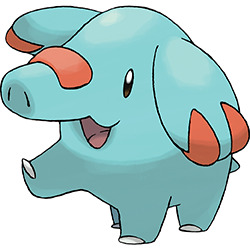
Phanpy is pretty cute, just a nice blue elephant with a few bright red accents. At this stage, it doesn't have much of a concept, but the colors alone make it stand out a little despite it otherwise being pretty unremarkable.
I have to say though, there is a bit of a weird disconnect between it and Donphan. There really aren't any visual elements that the two have in common (I guess the red patch on the trunk looks a bit like Donphan's treads?), the faces and general moods are different, and the colors couldn't be further apart (Phanpy's being oversaturated and Donphan's having almost no color). It really feels like they took two unrelated elephant designs and then slapped 'em together into one line.
I do feel like this could be an easy fix. Phanpy could easily have the same "chains" on the legs (make them look like kneepads or something that connects to the tire theme), give it like two more patches on the face to mimic Donphan's trunk, and maybe make it a slightly lighter blue while making Donphan more of a blue with maybe a spot or two of red accents. It's not that either are bad as-is; they just aren't as coherent of a line as they could potentially be.
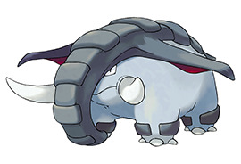
Line aside, Donphan is pretty neat. An elephant is one thing, but making an elephant that rolls up into a tire is another thing entirely. The execution of this concept is also nice; the tire patterning feels natural, you can tell how it rolls up just by looking at it, and the various animations of it rolling are pretty slick as well.

My only nitpick is that the ears stick straight out and that throws the tire shape a little—I wouldn't have minded them being floppier like Phanpy's. I also wouldn't minded a bit more color in the design, though it might just be Phanpy's oversaturation speaking there.
Overall, the line feels a bit disconnected, but both Pokemon are nicely designed and Donphan in particular has a great concept and a great execution.

Great Tusk is actually pretty intimidating; it's hard to describe, but it's pretty eerie turning a corner in SV and being suddenly greeted by the titan version of this thing slowly moving around a corner. This effect is furthered by exaggerating some of Donphan's elements, such as the much larger tusks, squinting yellow eyes, and wicked-looking mouth.
Visually, I kind of prefer it over original Donphan a bit, even though original Donphan is perfectly good as well. The colors on this one are particularly nice—purple and pink give it just the right amount of "pop" while not making it look overly garish (and ironically, the pink kind of ties into Phanpy's red accents despite Great Tusk not evolving from Phanpy).
I guess you could argue that the back spikes, color, and tusks kind of detract from the "tire" concept, but then again, I'd argue that's the point—Iron Treads is the one that really leans into the tire thing, while Great Tusk is more leaning into a woolly mammoth side, what with the added fur. It's a nice way to justify both designs, as each design leans into a different "half" of Donphan.
I don't like Iron Treads as much as either Donphan or Great Tusk, but I can give it points right off the bat for at least being Different than Donphan instead of just a robotic version of the same design. I know that's not much, but it's more than the other future Paradoxes try to do at least. The bright red paneling on the treads in particular really gives it a unique element, and helps draw attention to the smoother, more conveyor-belt like shape.
However, something about it is just a little off. I think it's the head, which looks laughably tiny compared to the body; not helped by it lacking a neck. Donphan doesn't have much of a head either, but it at least gives the impression of it having a tiny bit of a head and a much larger face than this thing's LEDs would suggest. I also find the "ears" a bit odd (why are they on the middle of the torso?) and the tusks feel pretty pointless on this version, to the point where I'd almost say they should've just been dropped. Right idea, but it could've been a little stronger.
(Also, side note: Shoutout to Iron Treads here for being one of the only future Paradox 'mons whose typing actually makes sense.)
As a whole, Phanpy is cute and simple, albiet without much of a through line to its evo. Donphan has a solid concept and design, Great Tusk does what Donphan is doing but really makes it stand out, and Iron Treads at least stands out from the other future Paradoxes, even if it could've been stronger. Overall, some good elephants.
72 notes
·
View notes
Text
Coronagrifting: A Design Phenomenon
We now interrupt our regularly scheduled content to bring you a critical essay on the design world. I promise you that this will also be funny.
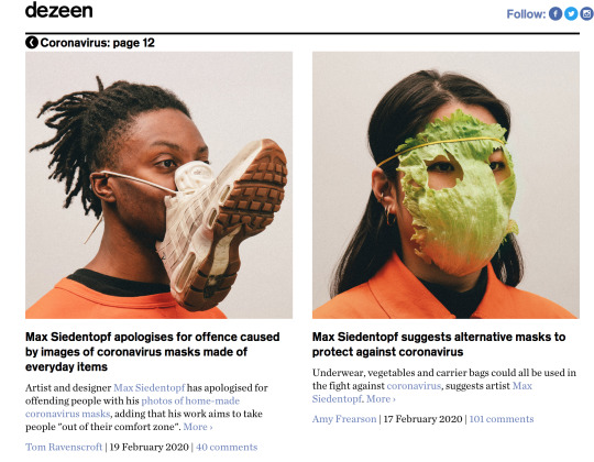
This morning, the design website Dezeen tweeted a link to one of its articles, depicting a plexiglass coronavirus shield that could be suspended above dining areas, with the caption “Reader comment: ‘Dezeen, please stop promoting this stupidity.’”

This, of course, filled many design people, including myself, with a kind of malicious glee. The tweet seemed to show that the website’s editorial (or at least social media) staff retained within themselves a scintilla of self-awareness regarding the spread a new kind of virus in its own right: cheap mockups of COVID-related design “solutions” filling the endlessly scrollable feeds of PR-beholden design websites such as Dezeen, ArchDaily, and designboom. I call this phenomenon: Coronagrifting.
I’ll go into detail about what I mean by this, but first, I would like to presenet some (highly condensed) history.
From Paper Architecture to PR-chitecture
Back in the headier days of architecture in the 1960s and 70s, a number of architectural avant gardes (such as Superstudio and Archizoom in Italy and Archigram in the UK) ceased producing, well, buildings, in favor of what critics came to regard as “paper architecture.” This “paper architecture” included everything from sprawling diagrams of megastructures, including cities that “walked” or “never stopped” - to playfully erotic collages involving Chicago’s Marina City. Occasionally, these theoretical and aesthetic explorations were accompanied by real-world productions of “anti-design” furniture that may or may not have involved foam fingers.
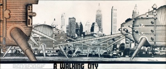
Archigram’s Walking City (1964). Source.
Paper architecture, of course, still exists, but its original radical, critical, playful, (and, yes, even erotic) elements were shed when the last of the ultra-modernists were swallowed up by the emerging aesthetic hegemony of Postmodernism (which was much less invested in theoretical and aesthetic futurism) in the early 1980s. What remained were merely images, the production and consumption of which has only increased as the design world shifted away from print and towards the rapidly produced, easily digestible content of the internet and social media.
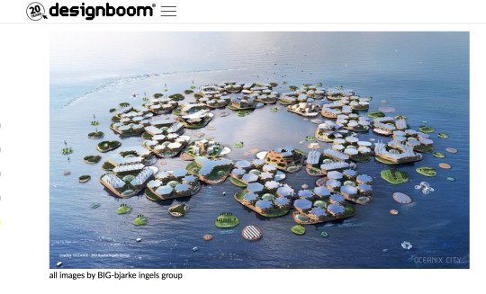
Architect Bjarke Ingels’s “Oceanix” - a mockup of an ecomodernist, luxury city designed in response to rising sea levels from climate change. The city will never be built, and its critical interrogation amounts only to “city with solar panels that floats bc climate change is Serious” - but it did get Ingels and his firm, BIG, a TED talk and circulation on all of the hottest blogs and websites. Meanwhile, Ingels has been in business talks with the right-wing climate change denialist president of Brazil, Jair Bolsonaro. (Image via designboom)
Design websites are increasingly dominated by text and mockups from the desks of a firm’s public relations departments, facilitating a transition from the paper-architecture-imaginary to what I have begun calling “PR-chitecture.” In short, PR-chitecture is architecture and design content that has been dreamed up from scratch to look good on instagram feeds or, more simply, for clicks. It is only within this substance-less, critically lapsed media landscape that Coronagrifting can prosper.
Coronagrifting: An Evolution
As of this writing, the two greatest offenders of Coronagrifting are Dezeen, which has devoted an entire section of its website to the virus (itself offering twelve pages of content since February alone) and designboom, whose coronavirus tag contains no fewer than 159 articles.
Certainly, a small handful of these stories demonstrate useful solutions to COVID-related problems (such as this one from designboom about a student who created a mask prototype that would allow D/deaf and hard of hearing people to read lips) most of the prototypes and the articles about them are, for a lack of a better word, insipid.
But where, you may ask, did it all start?
One of the easiest (and, therefore, one of the earliest) Coronagrifts involves “new innovative, health-centric designs tackling problems at the intersection of wearables and personal mobility,” which is PR-chitecture speak for “body shields and masks.”
Wearables and Post-ables
The first example came from Chinese architect Sun Dayong, back at the end of February 2020, when the virus was still isolated in China. Dayong submitted to Dezeen a prototype of a full mask and body-shield that “would protect a wearer during a coronavirus outbreak by using UV light to sterilise itself.” The project was titled “Be a Bat Man.” No, I am not making this up.
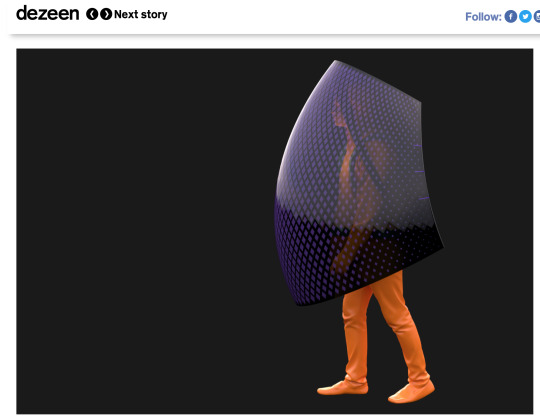
Screenshot of Dayong’s “Be a Batman” as seen on the Dezeen website.
Soon after, every artist, architect, designer, and sharp-eyed PR rep at firms and companies only tangentially related to design realized that, with the small investment of a Photoshop mockup and some B-minus marketing text, they too could end up on the front page of these websites boasting a large social media following and an air of legitimacy in the field.
By April, companies like Apple and Nike were promising the use of existing facilities for producing or supplying an arms race’s worth of slick-tech face coverings. Starchitecture’s perennial PR-churners like Foster + Partners and Bjarke Ingels were repping “3D-printed face shields”, while other, lesser firms promised wearable vaporware like “grapheme filters,” branded “skincare LED masks for encouraging self-development” and “solar powered bubble shields.”
While the mask Coronagrift continues to this day, the Coronagrifting phenomenon had, by early March, moved to other domains of design.
Consider the barrage of asinine PR fluff that is the “Public Service Announcement” and by Public Service Announcement, I mean “A Designer Has Done Something Cute to Capitalize on Information Meant to Save Lives.”
Some of the earliest offenders include cutesy posters featuring flags in the shape of houses, ostensibly encouraging people to “stay home;” a designer building a pyramid out of pillows ostensibly encouraging people to “stay home”; and Banksy making “lockdown artwork” that involved covering his bathroom in images of rats ostensibly encouraging people to “stay home.”
Lol. Screenshot from Dezeen.
You may be asking, “What’s the harm in all this, really, if it projects a good message?” And the answer is that people are plenty well encouraged to stay home due to the rampant spread of a deadly virus at the urging of the world’s health authorities, and that these tone-deaf art world creeps are using such a crisis for shameless self promotion and the generation of clicks and income, while providing little to no material benefit to those at risk and on the frontlines.
Of course, like the mask coronagrift, the Public Service Announcement coronagrift continues to this very day.
The final iteration of Post-able and Wearable Coronagrifting genres are what I call “Passive Aggressive Social Distancing Initiatives” or PASDIs. Many of the first PASDIs were themselves PSAs and art grifts, my favorite of which being the designboom post titled “social distancing applied to iconic album covers like the beatle’s abbey road.” As you can see, we’re dealing with extremely deep stuff here.
However, an even earlier and, in many ways more prescient and lucrative grift involves “social distancing wearables.” This can easily be summarized by the first example of this phenomenon, published March 19th, 2020 on designboom:

Never wasting a single moment to capitalize on collective despair, all manner of brands have seized on the social distancing wearable trend, which, again, can best be seen in the last example of the phenomenon, published May 22nd, 2020 on designboom:

We truly, truly live in Hell.
Which brings us, of course, to living.
“Architectural Interventions” for a “Post-COVID World”
As soon as it became clear around late March and early April that the coronavirus (and its implications) would be sticking around longer than a few months, the architectural solutions to the problem came pouring in. These, like the virus itself, started at the scale of the individual and have since grown to the scale of the city. (Whether or not they will soon encompass the entire world remains to be seen.)
The architectural Coronagrift began with accessories (like the designboom article about 3D-printed door-openers that enable one to open a door with one’s elbow, and the Dezeen article about a different 3D-printed door-opener that enables one to open a door with one’s elbow) which, in turn, evolved into “work from home” furniture (”Stykka designs cardboard #StayTheF***Home Desk for people working from home during self-isolation”) which, in turn, evolved into pop-up vaporware architecture for first responders (”opposite office proposes to turn berlin's brandenburg airport into COVID-19 'superhospital'”), which, in turn evolved into proposals for entire buildings (”studio prototype designs prefabricated 'vital house' to combat COVID-19″); which, finally, in turn evolved into “urban solutions” aimed at changing the city itself (a great article summarizing and criticizing said urban solutions was recently written by Curbed’s Alissa Walker).

There is something truly chilling about an architecture firm, in order to profit from attention seized by a global pandemic, logging on to their computers, opening photoshop, and drafting up some lazy, ineffectual, unsanitary mockup featuring figures in hazmat suits carrying a dying patient (macabrely set in an unfinished airport construction site) as a real, tangible solution to the problem of overcrowded hospitals; submitting it to their PR desk for copy, and sending it out to blogs and websites for clicks, knowing full well that the sole purpose of doing so consists of the hope that maybe someone with lots of money looking to commission health-related interiors will remember that one time there was a glossy airport hospital rendering on designboom and hire them.
Enough, already.
Frankly, after an endless barrage of cyberpunk mask designs, social distancing burger king crowns, foot-triggered crosswalk beg buttons that completely ignore accessibility concerns such as those of wheelchair users, cutesy “stay home uwu” projects from well-to-do art celebrities (who are certainly not suffering too greatly from the economic ramifications of this pandemic), I, like the reader featured in the Dezeen Tweet at the beginning of this post, have simply had enough of this bullshit.
What’s most astounding to me about all of this (but especially about #brand crap like the burger king crowns) is that it is taken completely seriously by design establishments that, despite being under the purview of PR firms, should frankly know better. I’m sure that Bjarke Ingels and Burger King aren’t nearly as affected by the pandemic as those who have lost money, jobs, stability, homes, and even their lives at the hands of COVID-19 and the criminally inept national and international response to it. On the other hand, I’m sure that architects and designers are hard up for cash at a time when nobody is building and buying anything, and, as a result, many see resulting to PR-chitecture as one of the only solutions to financial problems.
However, I’m also extremely sure that there are interventions that can be made at the social, political, and organizational level, such as campaigning for paid sick leave, organizing against layoffs and for decent severance or an expansion of public assistance, or generally fighting the rapidly accelerating encroachment of work into all aspects of everyday life – that would bring much more good and, dare I say, progress into the world than a cardboard desk captioned with the hashtag #StaytheF***Home.
Hence, I’ve spent most of my Saturday penning this article on my blog, McMansion Hell. I’ve chosen to run this here because I myself have lost work as a freelance writer, and the gutting of publications down to a handful of editors means that, were I to publish this story on another platform, it would have resulted in at least a few more weeks worth of inflatable, wearable, plexiglass-laden Coronagrifting, something my sanity simply can no longer withstand.
So please, Dezeen, designboom, others – I love that you keep daily tabs on what architects and designers are up to, a resource myself and other critics and design writers find invaluable – however, I am begging, begging you to start having some discretion with regards to the proposals submitted to you as “news” or “solutions” by brands and firms, and the cynical, ulterior motives behind them. If you’re looking for a guide on how to screen such content, please scroll up to the beginning of this page.
----
If you enjoyed this article, please consider subscribing to my Patreon, as I didn’t get paid to write it.
5K notes
·
View notes
Photo

Figure of an Elephant with Two Miniature Vases, 18th century, Brooklyn Museum: Asian Art
Rather small figure of an elephant bearing two miniature vases topped by a crown on its back. The animal is standing with its head turned to the right and with a large saddle blanket and bejeweled trappings. The first vase, securely fastened to the elephant's back, has a rather low foot, an ovoid body with high shoulders, and a medium sized neck with a concave outline. The second vase is of a double gourd shape, each body globular and the neck rather low, of medium width, and also concave in outline. The crown is in the shape of a concave plaque with a hollow depression in the center, from the underside of which projects a short tube. This is used to hold the crown in place. Copper, gilded on the rims and on certain parts of the elephant's anatomy and trappings. The rest of the outside surface is covered with cloisonné enamels. The elephant is a dirty white, streaked by the long undulating lines of the cloisons. His ears are pink. The trappings are in red, pink, dark blue and green. The large blanket, which has a gilt fringe, is decorated with a central panel containing sacred isle, wave, cloud, and swastika patterns, and is framed by a wide border of lotus scrolls. A smaller pad on top of this has a honeycomb design. The lower vase is patterned with lotus scrolls, ju i head and stiff leaf borders. The upper vase has two medallions on each side containing the characters ta chi, meaning great good fortune, set on a ground of lotus scrolls bordered by false gadroons. The crown has an outer fringe of bats, cut in openwork and enameled red, white, and green, and an inner border of false gadroons. The center depression is gilded. The colors of the enamel are dark blue, two shades of green, yellow, red, pink, and white, and the ground is usually turquoise. The surface of the enamel is pitted. The upper vase and the crown are now separate from the outer part. The lower vase is filled with some dark sticky substance. Size: 12 x 7 x 4 1/2 in. (30.5 x 17.8 x 11.4 cm) elephant: 5 x 7 x 4 1/2 in. (12.7 x 17.8 x 11.4 cm) Medium: Cloisonné enamel on copper alloy
https://www.brooklynmuseum.org/opencollection/objects/20188
99 notes
·
View notes
Text
in which dani and jamie sit in the dark kitchen of their vermont rental at 3 a.m. and flirt and bump bare feet under the table
**
On the nights she can’t sleep, Dani finds her way to the kitchen.
They’ve only been in the rental for a few months, but she already knows the shape of it in the dark. The nightmares rouse her from her sleep about two or three times a week, and with Jamie beside her, it gets harder and harder to drag herself out of bed.
But if she stays, she’s liable to slip back into the dreams – the waking terrors that make shapes out of the shadow of the doorframe, that coax faces from the scritch of branches against the window pane. She swears, one night, that she sees the Lady at the foot of her bed and doesn’t sleep right for days.
Dani makes it through the hallway without casualty, but jolts her hip on the mid-century modern sideboard in the foyer with a muffled curse. The rental is a tiny, one-story cottage outside of Montpelier, with a postage stamp backyard and screened in front porch that Jamie is already over-filling with potted plants and flower boxes.
Dani keeps reminding her not to get settled, that they might leave soon, might not be there for long, and Jamie gives her that fond, squinted look she often does, ducks in for a kiss rather than reply.
The former tenant of the cottage leaned hard into late-70s interior design, with garish wooden paneling and plush, sepia-toned rugs. Dani mutes the art-deco color blocks of linoleum in the kitchen with only the watery light above the stove, and puts the kettle on in the half-dark.
Already, staring hard at the red flare of the burner, she can’t remember the dream that woke her. Just the muddled shape of it, the discomfort and anxiety steeping in her chest, a dark rot that threatens to blacken her from the inside out.
She preps the tea in a ceramic pot on the stove, the loose-leaf blend that Jamie prefers, then milk, sugar, enough that she can feel the ghost of Jamie’s wince from three rooms away.
Slumping over the tiny table in the kitchenette, the mug warms her palms, soothing away the late-fall chill, sweatpants settling low on her hips.
She doesn’t hear Jamie until she is already behind her, the shush of her footsteps, a warm hand on the back of her neck.
“Okay, sweetheart?”
Startling, Dani turns into her touch, soothed to find Jamie looking grumpy and bed-rumpled, dark curls a mess, sleeves of an overlong flannel slipping down her wrists.
Sweetheart is the sleepiest of Jamie’s affections, with Poppins reserved for daylight and teasing, and baby for when Dani is sad, for wiping tears off her chin or tucking her against her shoulder. Most times, there are no pet name at all, just a brusque tone and a hand on her cheek.
Sometimes, to take the piss, Jamie calls her Danielle and mimics her American accent, words flattened and elongated enough to make Dani scowl. But sweetheart is for the kitchen, for kettle warmed fingers and cold tiles.
“You didn’t have to get up,” Dani says. She reaches for Jamie’s hand, brings it to her mouth and brushes a kiss over her knuckles. “I’m fine.”
“Couldn’t sleep anyway,” Jamie says. A lie, but the harmless kind. The things she says to put Dani at ease. “Bed was too still without all your tossing and turning.”
“There’s tea,” Dani says, “If you want some.”
Jamie approaches the stove wearily, and Dani gets up to follow, fetches a mug from the shelf over the spice rack.
“I don’t think,” Jamie says carefully, “that you would ever intentionally hurt me.” She squints skeptically at the pot. “But mistakes do happen.”
“Baby,” Dani says, stuck between laughter and a pouting, little-kid-petulance, “it isn’t going to kill you.”
She steps closer until their hips bump, taking Jamie’s sleeve between a thumb and two fingers and ducking in.
“Aren’t I getting better? I feel like all the practice we’ve been doing,” she lingers on the words, noses at Jamie’s cheek, talks like this might not be about tea, after all, “I think I’m really learning a lot.”
Tucking her lips into her mouth, Jamie disguises a smile, eyes hooded. “It has been a very educational few months, I’ll give you that.”
Dani buries her face in Jamie’s neck to hide a blush and camps out there for a while, just because.
Blanket-warm and sleepy, Jamie still smells like the sheets on their bed, like detergent and soft cotton, the milky skin under her jaw holds a trace of perfume. Dani purses her lips in a quiet just-because kiss against her throat, then another, open mouth, humid breath.
Jamie worms in closer, hips butting, reaching around Dani to take the ceramic mug from her hands and rest it on the stovetop.
“Careful, there,” she says. “You’re going to wake me up for good if you keep that up.”
Dani nods into her neck, accepts an arm around her waist, curls her fingers in the front of Jamie’s flannel. “I’m not going back to sleep, anyway.”
A hum of concern. “Bad dreams again?”
“Always.” This mumbled, grumpily, and Jamie pulls back to pet her fringe out of her eyes.
“Do you want to talk about it?”
“Not really.” Dani leans harder into the touch, proffers her cheek for a kiss. Jamie obediently obliges, before pushing her away to continue preparing her tea, nudging Dani back toward the bench seat of the table.
Closing her eyes, the clink of the spoon against the lip of the mug is familiar. So is the sound of Jamie turning off the stove, the hiss-spit as the gas clicks off. Jamie settles at the bench across from her, sets her chin in her palm.
“Think I’m going to pick up groceries in the morning, if you want to come,” Jamie says.
Dani opens her eyes, watches Jamie watch her, and realizes, all at once, how perfectly settled she feels. Grounded, for the first time in years, maybe ever. With a flicker of embarrassment, she realizes that the thought of going to the shop with Jamie does actually excite her – hands knocking between them as Jamie stands for far too long in front of the water-misted produce, a kiss stolen in the narrow aisles of canned goods, cold-cut sandwiches picked up from the deli window next to the butcher.
It’s sickeningly domestic, and perfect, and awful. Jamie looks at her steadily, and Dani looks back.
“I really, really like you,” Dani says, a little woozy. Sleep deprived, and drowsy, the stove still radiating a steady heat, and Jamie looking at her like that – all soft eyes, cupped chin, bare feet knocking under the kitchen table.
Jamie smiles, a little flushed, pleased. “Is that a yes to groceries, then?”
“Definitely a yes.” Dani reaches for her, and Jamie takes her hand, plays a thumb across her palm, stroking gentle over her love line.
Dani wants to say: I didn’t think I could ever have this.
Wants to say: I never thought sitting across from someone at 3 a.m. watching them drink the shitty tea that I made in a pair of shorts I’m pretty sure are mine could make my entire body feel like melted butter, that I could feel pleasure just from the way you touch me, that I would stand in an endless line at a crowded supermarket every Sunday morning if you were in front of me in high-waisted blue jeans picking out a chocolate bar for us to share on the ride home.
Instead she says: “If we have time, we could go to the farmer’s market after? Get those apples you like?”
Jamie answers her with a kiss. Leans across the table and catches her mouth messily, jarring Dani’s mug of tea and sending the lukewarm liquid sloshing. She pulls away laughing, rubs at her own mouth like she’s embarrassed.
“Yeah, Poppins, I figure we can fit that in.”
***
After the store and the market and a meandering drive home – one where Dani spends too long groping at Jamie’s thigh at every stop sign until she gets batted away – they find an autumnal patch of sunlight on the porch and drag the wicker chairs to meet it. Every hour, as the sunlight shifts, Jamie makes a show of moving the chairs a few inches to the left, often with Dani still in hers, giggling as Jamie groans the whole time.
There is a paper bag of apples at their feet, Honeycrisp and McIntosh, more than they could ever readily eat, though Dani promises, absently, to make a pie. Jamie will swear Dani was conned into it by the pretty girl at the apple stand, and Dani laughs, genuine and loud, like she could have eyes for anyone but her.
“Yeah, but we all know pretty girls have always been your weakness,” Jamie says. She inspects the apples for bruises and chooses one carefully, like the decision could determine the entire fate of their afternoon. “I mean –” she gestures at herself, buffs the apple on her knit sweater, “look at me.”
“Oh, modest,” Dani laughs, inching her chair closer to pinch at her arm. “I wasn’t even—”
“You were most certainly flirting.” She reaches for a paring knife resting on the window sill beside them and peels away a long stripe of the apple’s skin, mottled red and green, tossing it into a separate pile for composting. “Don’t think I didn’t hear you, all ‘oh, yes whatever you say, miss, I mean you are the expert, and so good with your hands, too.’”
At this she drops into an awful approximation of Dani’s midwestern accent, seeming to derive great pleasure in doing so, payback for Dani’s even worse British one, hardly making it through the sentence before she starts to laugh.
“I absolutely did not say that,” Dani says, fully affronted now. “And I definitely don’t sound like that.”
Jamie swivels in her seat to face her, grinning, all-together too pleased with herself, speaking around a mouthful of muffled laughter and a slice of apple.
“I took some creative liberties,” Jamie says. “I have every right to, anyhow. I mean you did travel across the ocean with the first pretty girl you saw.”
“Not the first. And can you blame me?” Dani asks, a little quieter, tilting her head to meet Jamie’s eyes full-on. Her words are more weighted than she means them to be, because that’s the thing isn’t it – that it isn’t just any girl, that it’s Jamie, her Jamie, and – “I’d do it again. Travel across oceans, I mean. For you.”
Two points of color rise in Jamie’s cheeks, and she ducks her chin into the lip of her sweater, hiding from Dani’s eyes for a second.
“Christ, Dani,” she says, emerging. “Didn’t have to go full romantic on me.”
“I wasn’t flirting with the apple girl, anyhow,” Dani says, biting hard at her lip. “I just know you like the apples, so.”
“Yeah,” Jamie says, eyes dropping somewhere low on Dani’s face. “They’re my favorite.”
Taking the knife to the fruit, she carves away a bite of tender, white flesh, holds it out for Dani to take. Dani opens her mouth, and Jamie’s eyes narrow, lips parting. She feeds it to her slowly, Dani’s teeth scraping against her fingers, a hint of tongue.
It’s ripe, tart, pared perfectly with the sawdust-sunlight clinging to the porch, to Jamie’s fingers lingering on her lips, to the rest of the afternoon stretching ahead of them, and maybe a few more after that.
“You didn’t sleep too well last night, did you?” Jamie asks, clearing her throat.
Confused, Dani wrinkles her forehead. “No, but, I mean, you knew that.”
“Right, well.” A shrug. “I just figured you must be tired, we could get a head start on it, then. Head to bed now, maybe. If you wanted.”
“Oh.” Eyebrows jumping, Dani feels the thrill of it, down to her fingertips, tilts her head to check the kitchen clock through the open doorway. “It’s 3 p.m., how ever will we fill the time?”
“I can think of a few things.” Already, Jamie is moving to her feet, reaching out a hand for Dani to take. Her fingers are sticky with juice from the apple, her cheeks still a little flushed, hair falling wild out of its haphazard ponytail.
Dani thinks about taking the fingers to her mouth, again, thinks about all the things that can fill a Sunday afternoon when you have nowhere else to be. Leaving the bag of apples behind them, it’s Dani who leads the way inside.
Laughing, Jamie hurries to catch up.
#the haunting of bly manor#jamie x dani#my writing#shout out to that anon two weeks ago who asked if i would ever write fic#its not 15k words but i literally cant stop thinking about them#also shoutout to a friend who made me want to take a closer look at a snapshot of the two of them sitting together and drinking tea while#looking way too enamored with each other
156 notes
·
View notes